Whole Foods Market
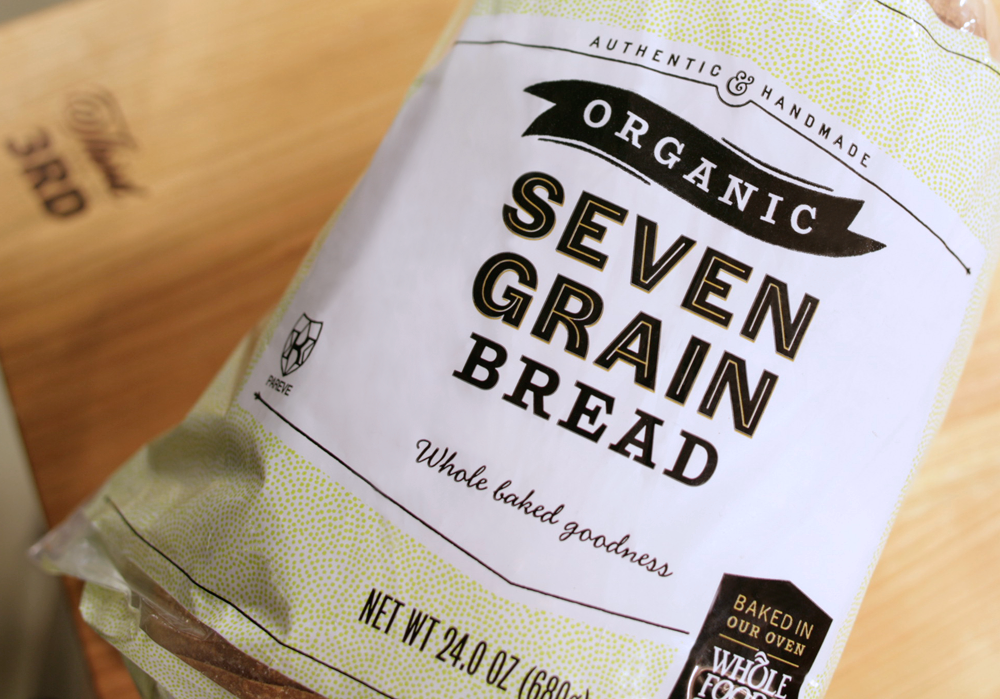
In anticipation of their first Brooklyn store, Whole Foods wanted to revitalize their private label and in-store signage system. The challenge was to give the packaging a distinctly handcrafted appeal that would resonate with their new Brooklyn audience—and eventually expand nationwide—while allowing flexibility in application, with countless label sizes and shapes.
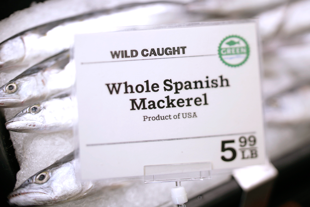
We established a modular system for the packaging in which the logo is recognizable without being overbearing, (we get it, it's Whole Foods!) and a rich typographic palette that adds a small-batch credibility. The number of packages this system has been applied to is astounding, and indicative of its versatility. We also redesigned the store's extensive signage system, replacing their long-used custom script with a more clean and current look.
CD and CUSTOM FONT: Matteo Bologna
AD & DESIGN: Andrea Brown
DESIGN: Kathleen Scudder
Studio: Mucca Design
RECOGNITION:
Print Regional Design Annual 2014